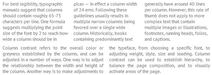
From the growth of technology the monitors are becoming wider and wider, and along with them, and blocks of text on websites. It is known that a person is most comfortable to read approximately 67-75 characters per line, but some browsers do not allow time to implement layout in multiple columns by using the built-in functionality. The Technologies are not standing, and more and more browsers are implementing will support multi-column text, which will be discussed in this article.
The demonstration of this process can be found in the text of the article.
Implementation:

As you may have guessed, the column-count property specifies the number of columns and column-gap — the distance between the columns. There are also additional features: column-width, allowing strictly set the width of columns and column-rule, which determines the divider between the columns (for example, 1px dotted #ccc, to separate columns dotted line). In addition, you can use prefixes and -webkit- and -moz- to support older versions of browsers. Thus, you can control columns, simply by changing the numerical values of the properties.
Adaptive multi-column text
What if our website has «rubber» layout and its width can vary, for example, from 320px to 1200px? In this case, we have the support of such a feature CSS, as a «media queries» (allowing to change the css-properties of the different objects, depending on the width of the user’s screen).
Let’s add after the above classes the following snippet:

This fragment is as follows: if the width of the screen is greater than or equal 1024px, let’s apply the properties contained in the block. In our case, we will overwrite some of the properties class: .three number of columns from the two will increase to three. Ok, it’s for large monitors. Let’s care of mobile devices — it does not need a column, so let’s go one step further and add a piece of code:

This code will work when the screen width 480px and less and display all of the text in one column.
Thus, we have the following scheme:
Screen Width <= 480px — one column of text.
Screen width from 480px to 1024px — two columns.
Screen width> = 1024px — three columns.

